I used to be crazy afraid to talk in public.
While it is so essential for a designer to communicate verbally
to defend and promote our own projects.
I remember at my design school.
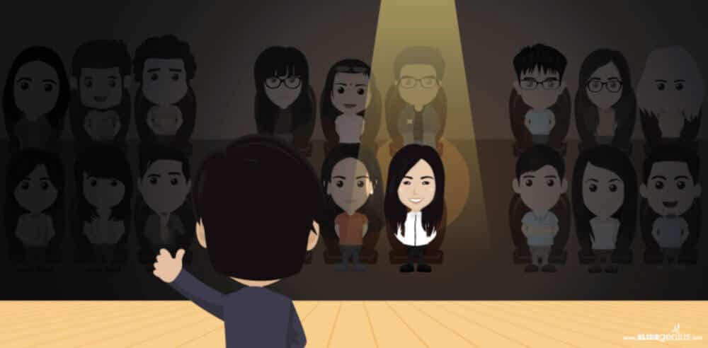
When I had to talk in front of my classmates, it was so intimidating.
I knew it was a training to get prepared for the real world of industrial designers though.
I was terrible at public speaking at the start. I was super anxious.

You know, it is like: “More you worry, more you think about failing your presentation… visualizing the shame… alone in front of so many eyes judging you…”
And it was like a never-ending vicious circle.
More you think about it, more you panic… -.-U Damn !!
“The awesomeness of your project won’t matter…
if it can’t be understood.”An industrial designer needs both:
Visual and Verbal presentation skills.
In my design school, we trained our oral presentation.
We had more than 20 presentations per year!

If you are shy and introverted, don’t worry there are solutions.
Introvert people can be great speakers! (Steve Jobs, Bill Gates… )
You can be introverted and excel in presentation too!
Let me help you share with you what I learned over the years.
Here we go for the series of TIPS!
(I keep the most important TIP for the last one.)

TIP 1 / Show & Tell !
In France, we don’t really learn about public speaking.
(even though we can debate for hours at dinner time :p ).
In the US, kids learn to talk in public at school with the Show and Tellsexercice.
For me, I had to learn that public speaking skills at 22 years old!
Hehe. It is never too late to start!
Now it is also your turn!
Choose a sketch you did, and talk about it to your friends.
It will be a great start!
Remember,
no matter how good at sketching you are,
a designer’s job has a lot about communication skills.
The best projects are not always the ones that win.
But the ones that are perceived like it.
Like How Michael DiTullo shared with us in his video interview on the blog, what is the most difficult is not creating your project. But to protect it. I invite you to click here to watch Michael DiTullo and myself’s video design interview :).
TIP 2 / BE AUTHENTIC
People who lack confidence tend to play a role. Trying to hide their weakness – worrying the audience may judge them and throw tomatoes to them.
However, most designers from any level I met are caring – and support students.
I don’t think an industrial designer can be evil bullying the youth.
It doesn’t make sense to me.
“If you do mistakes, it is all fine. You are human.
People don’t expect you to be perfect, but authentic. Be humble.”
Humility and authenticity win in the long run.
Remaining yourself will attract people with whom you match with. 🙂
Imagine you play a role of someone pretentious, and end in a company where everyone has to show off… If you are an introvert, it may drive you crazy soon!
When you have to present your portfolio at a design job interviews,
you don’t need to “Hard sell your project”.
People who welcome you are professionals.
Tell them how much you love helping people
through Industrial design – making a better world.
It can be seen in your work, understood in your words, but also felt in your voice.
So, keep your natural personality and sincerity.
That’s the most straight forward and natural way to succeed.
TIP 3 / SLOW DOWN
If you feel nervous, you may speak (too) fast and lose clarity.
If you lose people till they space out.
You will be like doing a monologue with no flavor…
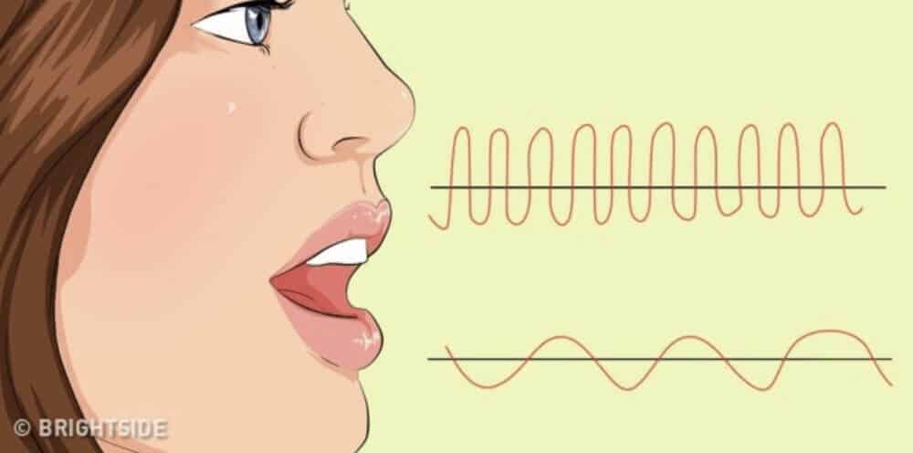
A trick is to take a breath slowly from your nose,
and exhale slowwwwly. with your mouth. Repeat 3 to 4 times.It will slow down your heart rhythm and speaking flow.
It is a great stress reliever.
When you speak slowlier, it gives you more time to think of your next move in advance when it is needed – or better observe people’s reactions if you wanna create interaction with them.
Avoid a monotonous tone of voice. Add in emotion in your sentence that expresses your passion and how much pleasure you had to create and deliver your project!
You are the maestro.
Your speech is like music people want to listen to.
 TIP 3 / PAUSE
If you forget your pitch, make a little pause. It is ok.
People will see you as a wise person whose thinking.
While you are trying to remember your next sentence or topic. That’s normal. 🙂
TIP 4 / Bring personal notes
Sometimes I bring some notes on a sheet of paper
that is not bigger than my hand.
Even though I realize I rarely use them.
I feel safer and comfortable just having them on hand.
Take handwritten notes instead of printed.
Your visual memory will spot the information you need faster
than from a computer typo.
If you carry multiple sheets of paper, write the page number on it.
Plus, you can use the colour code. Using a symbol or write with different pen colors to identify various topics or importance levels.
TIP 5 / Embrace questions
If a jury is asking you questions.
Don’t feel afraid of them. Embrace them.
They don’t want to trick you.
If they love your project, they will love to ask you questions to know more!
Questions rarely come in the middle of a presentation.
So don’t worry if you don’t get any before your conclusion.
A jury that ask you questions are interested in you.
So it is a great thing !
I invite you to initiate the dialogue at the end of your presentation.
Ask them if they do have questions, and that you are happy to answer.
The best is when the Q&A session becomes a discussion –
like when the jury even start to talk to each other as well.
TIP 6 / SMILE !
People will love to get your positivity.
Seeing you will be like receiving the warmth of a spring sunray.
We smile because we are happy right?
But, if you (deliberately) smile, the brain also gets happy!
The smile will sweeten your voice and give an extra boost of energy!
 TIP 7 / Eye contact
A trick to avoid people get distracted,
make eye contact with your public.
Once in a while during your speech,
chose a person and make an eye contact with him/her for 2 to 3 seconds.Redo the same with an other person. They will feel special.
Replace your shyness by taking care of your audience.
TIP 8 / The 3rd eye contact
If you feel shy to look at people’s eyes,
imagine a 3rd eye on the forehead of people. And look at this one.
It will be easier for you to look there when you address them : )
TIP 9 / Use simple words
The best way to lose people is to use complicated words.
If you need to use jargon, explain it.
Do not assume everyone knows about its definition.
Think of you are talking to a 5 years old kid or your grandmother.
That will make sure you gather all your audience’s attention and comprehension.
(Trying to look like an expert using purposely complicated words doesn’t work.)
TIP 10 / Be pumped!
I like to stretch myself before a presentation.
Some people jump or even do push-ups!
That extra flow of blood pumped by your heart will give you
that high energy to share with all.
And you might know about working overnight on your project, you may have panda eyes. But it is ok. Give your project the last shot, and give your best!
Tonight then, you’ll sleep early and happy.
 TIP 11 / Make your “enemy” your ally
Of course, there are no literal enemies there.
However, some faces may appear severe or stoic.
Don’t worry.
They often hide a melted heart. Their skin maybe just a bit thicker.
If you convince them of your project, they will be your best supporters!
If you are looking to improve your social skills, you can join some networking events with friends.
TIP 12 / MOST IMPORTANT: STORYTELLING
I end this article with the most important TIP here which is about telling a story.
When I was in my design school, there were two types of presentation:
- A: The “soporific” one
- B: The fascinating one!
Don’t start your presentation with:
- “Product manual user”
- Functions
- Technical description
- Complicated jargon
- Shows endless graphics and pie charts
- …
The soporific presentation is like a “User manual”…
For example : This driller is the fastest in the world thanks to the XXXXX technology properties that allows it to turn at XX tour/minutes.
Starting by how it works is boring.
Because you didn’t give any reason yet to people to follow you.
The “user manual” approach is the best way to lose your audience’s attention.
You don’t want their little voice in their head say: So what?
The fascinating presentation starts with:
- Starts with people (the users) in mind
- Value
- Benefits
- Needs
- Mood boards
- In other words, show how you help the target users’ life!
- …
A successful presentation tells a story!
Remember of Steve Jobs.
He didn’t call the iPod as “–Gb of memory device”. It talked about the hours of music, you can carry in your pocket! The experience matter. Not technology.
That is what resonate in people: Talk to their heart.
For example:
(I start with the user)
I’m creating for professionals workers building sky high tower.
They have a high productive expectation and tight deadlines.(Problem)
They are proud of their job. Quality and safety is essential for them.
But they feel stressed by the intense rhythm of work.(Danger)
It is physical and the daily exhaustion may drive to accidents.
Which can be a danger for the workers, the construction.(Official stats)
Every year, there is xxx accident that could be avoid if only…
Source : “Official source”(Goal)
I’m looking for a way to keep that high standard rate of construction, yet increasing safety for the workers. (I didn’t say: “My goal is to make the fastest driller ever.”)(Benefit)
With the driller (or alternative product you’ll create) the workers get things done earlier, with precision and no rush. (I didn’t say : “The benefit is to have a fast driller.”)(Inspiration and innovation)
Inspired by the woodpecker, we reinvent the driller by an apparel to fix on the wall and that auto drill.(Explanation)
Instead of having a heavy driller, the worker carry a set of 2 to 3 “woodpecker apparel” on hiss belt. Fix them on the walls and these auto drill themselves with the preconfigured parameters. All the hole made are exactly the same and reduce the % of the human factor error.
(Result)
The worker can now focus more are the quality of his work than trying to rush the quantity of work done.He doesn’t need any body strength to drill hundreds of holes on concreate per day anymore. No more back ache carrying heavy tools.
They can go home earlier and every day safer.
Make your design school your laboratory.
A designer is in the middle of an eco-system where you have to convince and talk to multiple departments from the Research & Development to the users.
I hope you see how important it is to improve your public speaking skills.
With that, you will dare to be more ambitious.
As you will gather the whole company team support!
(Feel free to share with me your experience in the comments
or send me an email at choutac@thedesignsketchook.com.
I would love to hear your stories. 🙂 )

 TIP 3 / PAUSE


 TIP 11 / Make your “enemy” your ally






[…] you are especially introvert like me, you know […]
[…] may not have the skills to have the greatest sketches. But you will learn to deliver on time with professional boards and presentations. Remember that the most important is to convey your message with a board that looks professional – […]