Spot existing color palettes around you
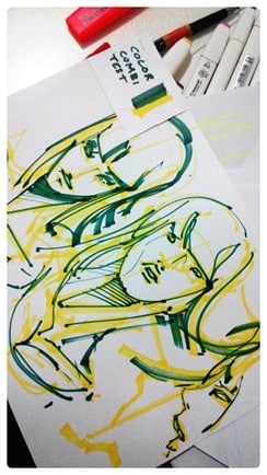
You can apply it to choose the marker colors combination for your sketches.
It just needs a bit of daily observation effort.
Look in the street, media, magazines cover, packaging, interior decoration, celebrities outfit, fashion editorials, flags, basketball logo, toys…
With a bit of conscious training and observation, you will notice multiple recurrent color combinations. It will soon appear obvious to you.
Very common color palettes:
- | Grey + Pink
- | Brown + Turquoise
- | Orange + Red
- |Green + Yellow
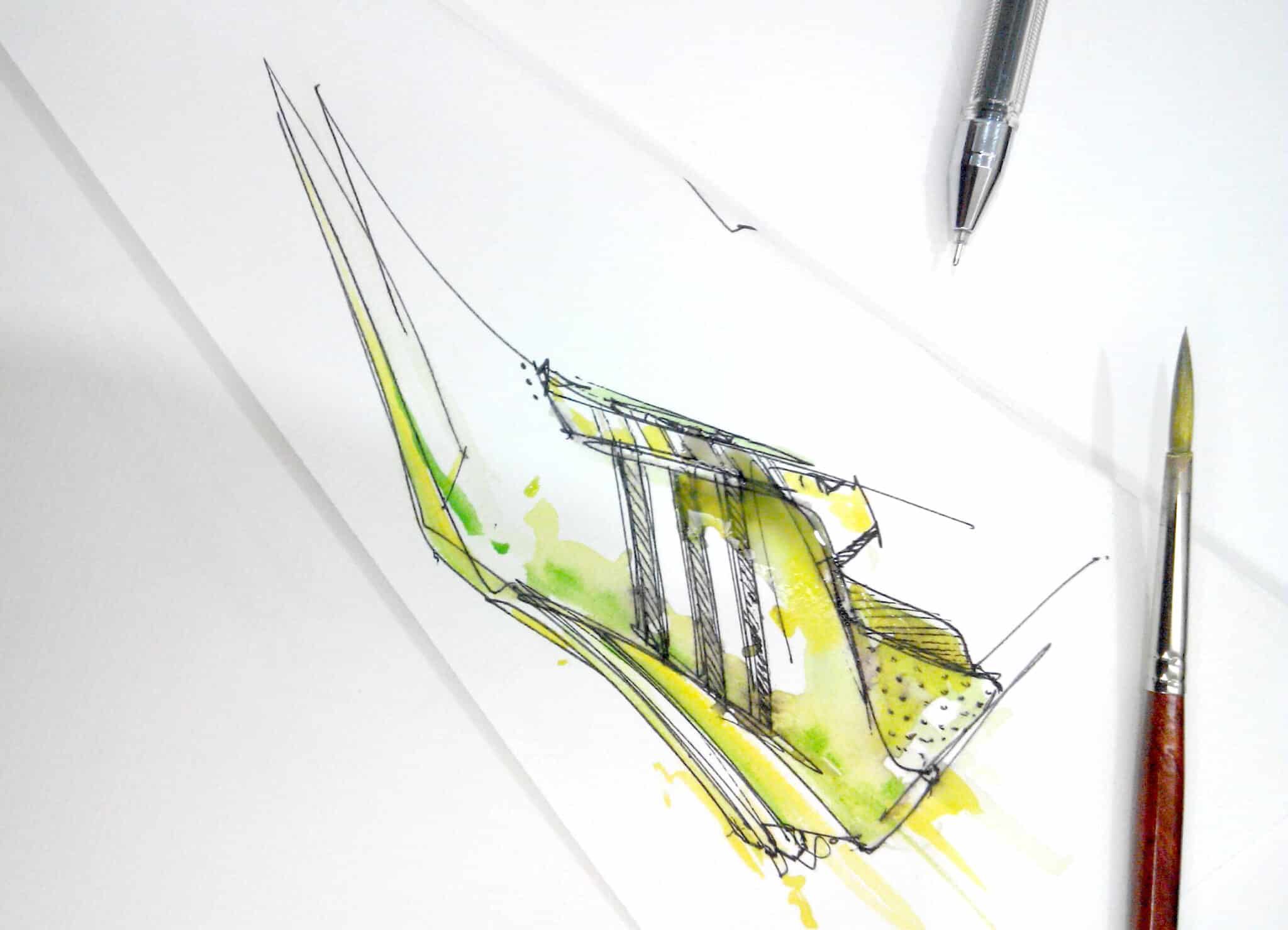
COLOUR RESEARCH A – LIME AND YELLOW
COLOUR RESEARCH B – VIRDIAN GREEN AND YELLOW
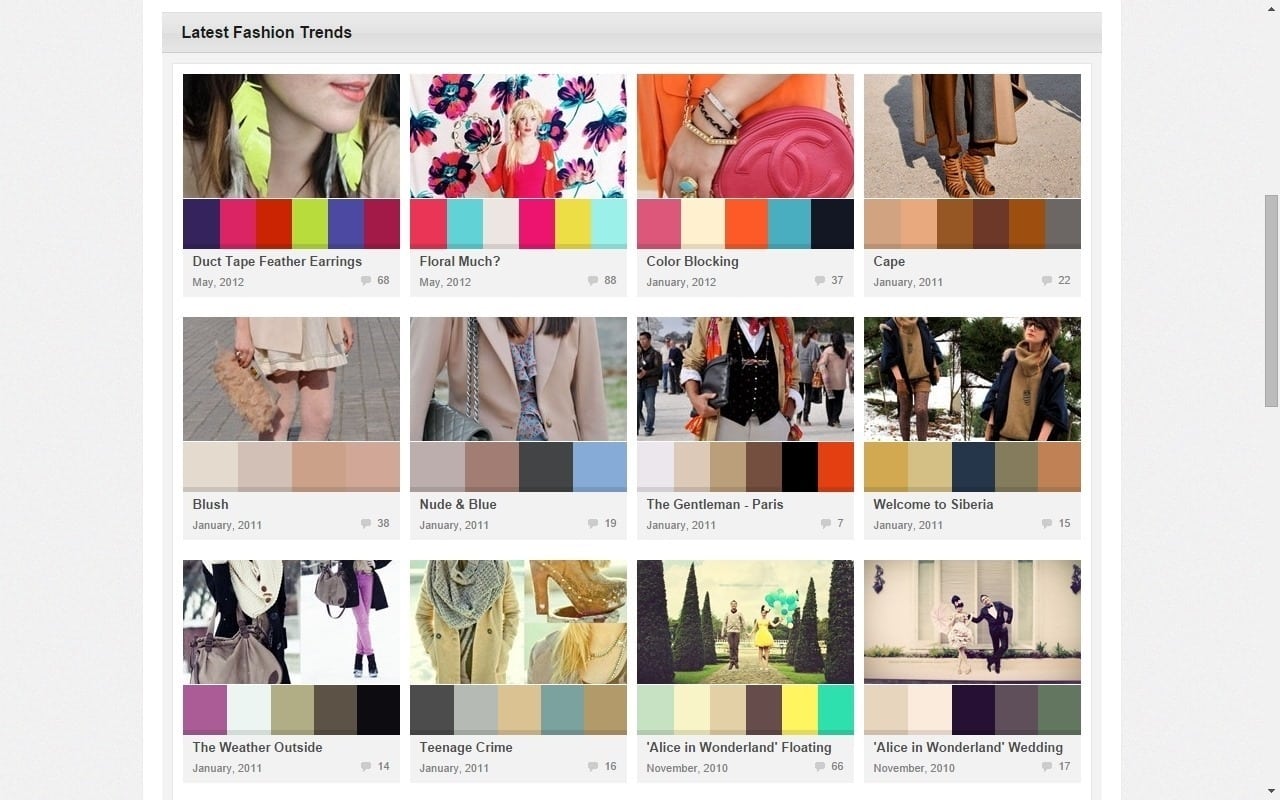
COLOUR LOVERS
A great website for color inspiration: https://www.colourlovers.com/palettes
The site picks up thousands of color palettes from Street fashion, magazines cover…
They have already done the analysis for you.
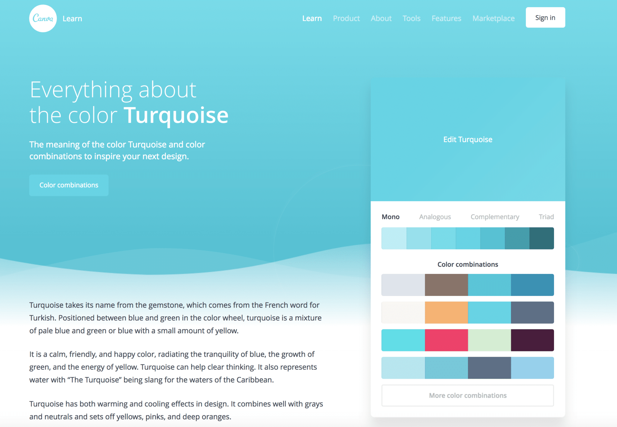
CANVA
https://www.canva.com/
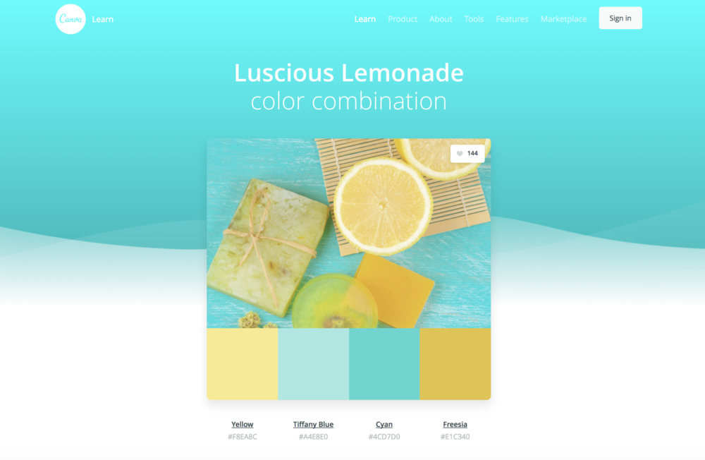
You will play with thousands of color palettes to get inspired by – as well as knowing everything about colors!
Let me know your tricks on color combination!
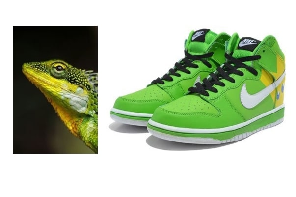
![green-yellow-lizard[8]](https://www.thedesignsketchbook.com/wp-content/uploads/2014/10/green-yellow-lizard8_thumb.jpg)
![Nike-Dunk-Green-Yellow-King-Pig-High-Tops-2[9]](https://www.thedesignsketchbook.com/wp-content/uploads/2014/10/Nike-Dunk-Green-Yellow-King-Pig-High-Tops-29_thumb.jpg)
![world cup brazil[17]](https://www.thedesignsketchbook.com/wp-content/uploads/2014/10/world-cup-brazil17_thumb.jpg)
![Paris Fashion Week - Louis Vuitton (Spring-Summer 2013) 14[19]](https://www.thedesignsketchbook.com/wp-content/uploads/2014/10/Paris-Fashion-Week-Louis-Vuitton-Spring-Summer-2013-1419_thumb.jpg)
![moschino-spring-RTW-2014[21]](https://www.thedesignsketchbook.com/wp-content/uploads/2014/10/moschino-spring-RTW-201421_thumb.jpg)
![c5ca1504f6f9396e05405b74da94f289[12]](https://www.thedesignsketchbook.com/wp-content/uploads/2014/10/c5ca1504f6f9396e05405b74da94f28912_thumb.jpg)
![gisele-bundchen-brazil[30]](https://www.thedesignsketchbook.com/wp-content/uploads/2014/10/gisele-bundchen-brazil30_thumb.jpg)
![f0eec56fe9ae86a3d041d495829662d3[26]](https://www.thedesignsketchbook.com/wp-content/uploads/2014/10/f0eec56fe9ae86a3d041d495829662d326_thumb.jpg)
![84eb4e8102c9cc135943d31de890cd67[20]](https://www.thedesignsketchbook.com/wp-content/uploads/2014/10/84eb4e8102c9cc135943d31de890cd6720_thumb.jpg)


Add comment