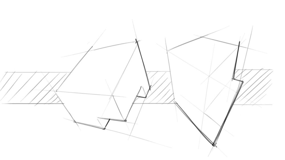
A designer needs to be good at visual communication.
A great designer communicates through images. When your ideas are clear and your sketches speak for themselves, you don’t need to stand there explaining, the board does the job for you!
Your goal is to guide the viewer’s eyes smoothly across your presentation: make it dynamic, attractive, and easy to read. This technique is a favorite among product and transport designers. By simply playing with line weight, they make their sketches pop right off the page.
Follow these simple steps, and your sketches will instantly look sharper, cleaner, and more professional. Let’s make your ideas shine!
STEP 1 Draw the Cube in Perspective
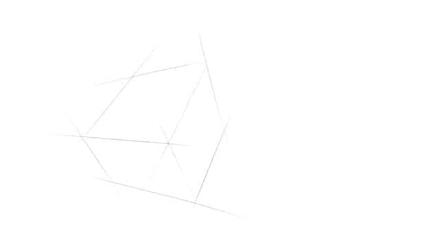
- Get ready to draw with a light pen pressure
- Draw a cube in perspective
STEP 2 Add Some Negative Space
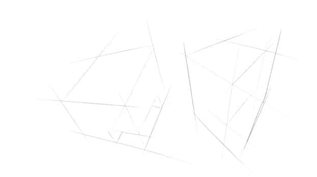
- Keep the same pen pressure
- Detail the cube by creating negative space
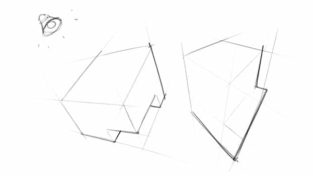
STEP 3 Define the Source Light and Add Line Weight
STEP 4 Draw the Background with Hatching
- Define a source of light – usually at the top left.
- Retrace the lines of the volume with slightly heavier lines.
- Bold the lines are opposite to the source of light – only the lines which are at the edge of a single surface.
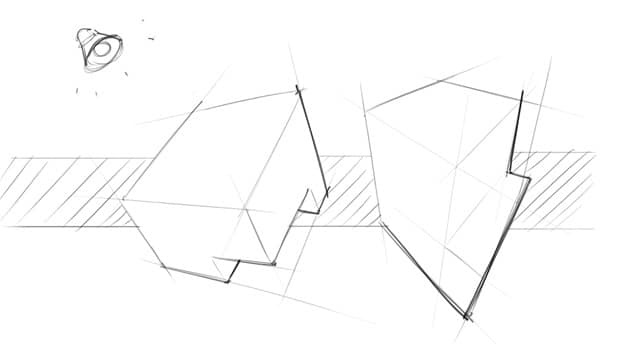
- Add a quick and simple background with hatching
That’s all!
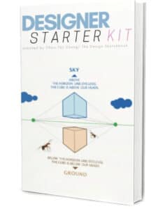
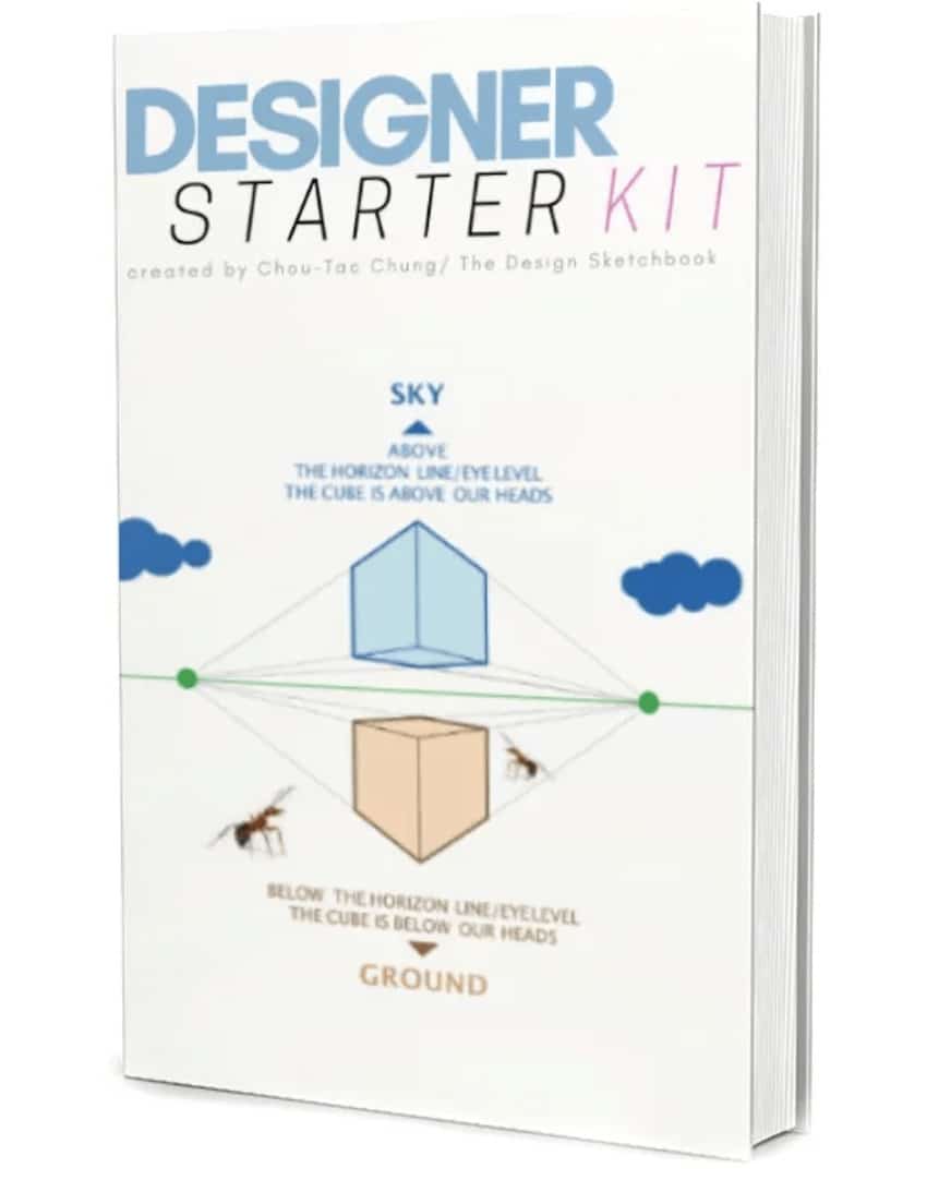
If you want to make your first steps in drawing, I invite you to download the Designer Starter Kit to start learning with the basics of perspective step-by-step.
The Designer Starter Kit exercises in 6 videos:
- How to draw straight lines
- How to draw a perfect square
- How to draw awesome circles
- How to sharpen your sense of proportion
- How to draw a cube with 1 point perspective
- How to draw a cube with 2 points perspective
Once again, these videos are linked to the Designer Starter Kit.
To enjoy the series of sketching tutorials better,
I recommend you guys to receive the book first.





Yea great tutorial, I didn’t know much of this stuff and it’s the little things that help out.
It’s interesting to know the techniques used to make designs stand out and how to present them which I find important.
I recently finished an ME degree but this is what I really want to do!