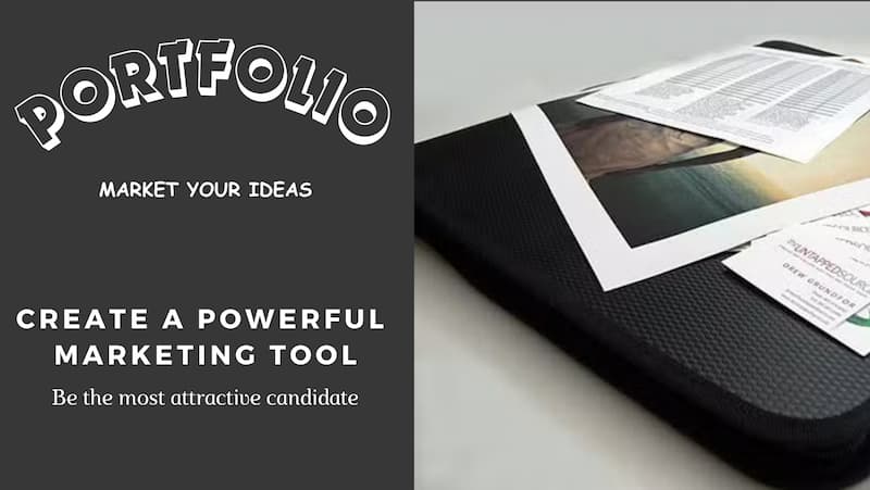
- Your Designer's Dream
- Stand Out from the Crowd
- The Power of the Portfolio
- Why This Matters
- 1. What is a Design portfolio?
- 2. Should I have an online portfolio?
- BONUS: About.me
- 3. What if people copy my idea?
- 4. Digital vs Printed Portfolio: Which to Choose?
- 5. What to Include in Your Design Portfolio
- Weapon #1: Stop boring "Accountant Resume"! Make it Attractive!
- Weapon #2: A Creative Business Card
- Weapon #3: Send a Mini-Portfolio
- Weapon #4: Extra Artworks
- Create a Separate Booklet
- Conclusion
Are you looking for a design job, but you have no portfolio yet?
You’ve learned to draw, to create, and you’ve even developed your own style!
Now it’s time to make a living from your acquired skills and apply for a creative job as a Professional Designer! :)
Your Designer’s Dream
You aspire to:
- Impact the world with your creations
- Join your dream design companies
All you need is for someone to give you a chance. Right?
But…The market is packed with talented designers competing with each other.
The world is loud, and you feel small and invisible.
I know it can be intimidating, especially the first time.
Stand Out from the Crowd

Today, I’m sharing secret methods I’ve learned and applied in my own career to help you stand out!
You’ll see it’s not about showing your beautiful sketches, but about helping them understand who you are and how you think.
This way, recruiters can envision:
- The value you can bring to the company
- How you can blend in and work together creatively, productively, and happily.
The Power of the Portfolio
What’s more powerful than a resume? The portfolio.
As a fresh graduate, your resume is as empty as a pea in a can. It’s not much different from other candidates who took babysitting gigs and part-time jobs at McDonald’s to earn extra money during their studies.
At the beginning, it’s not easy to shine in the crowd. But don’t worry.
Designers have an ace up their sleeve no other “regular jobs” have: their design portfolios.
Why This Matters
When you’re starting out with no network, your portfolio becomes your best ASSET for success.
If you do things right, you’ll kickstart your career with a snowball effect!
These techniques aren’t about becoming a better designer than you already are. They’re about showcasing your full potential in your portfolio and turning it into a Marketing Weapon.
I will share below 4 Marketing weapon techniques to make you irresistible.
Remember that if you are invited for an interview, and you’ve built an amazing designer profile:
YOU are the opportunity.
Some of you following the Design Sketchbook blog are landing exciting design job interviews at great companies! I wish you all the best of luck!
1. What is a Design portfolio?
A design portfolio is a compilation of the best of your work that you show to prospective employers when you apply for a job or an internship.
Your portfolio is the best business partner you’ll ever have, and it should basically be able to talk to you.
A portfolio shows your employers “How your brain works”.
Your portfolio showcases:
- your work,
- your personality and style,
- your creative thinking
- your interests,
- and your ambitions!
Every student designer needs to build one, and I definitely recommend you start early.
Your first projects might be clumsy, but don’t stress – you can freshen up the portfolio with newer, more skilled projects as you go. It’s great motivation to improve, as well, since you’ll always be trying to top your other designs with your latest addition.
I also recommend that you bring along one of your most creative research sketchbooks for one of the projects in your portfolio.
The quality of the lines and the artistic style of the research sketchbook don’t matter as much; what’s important is that you show your thought process and your creativity in your approach to the project.
2. Should I have an online portfolio?
Nowadays, online portfolios are pretty popular, and for good reason.
With them, you can expose your work to the world over.
Other designers can let you know that they appreciate your work, which can be the first step in building your network.
The world of design isn’t actually that big. Sooner or later, you might meet some of these designers in real life as a colleague, a friend, or a supplier.
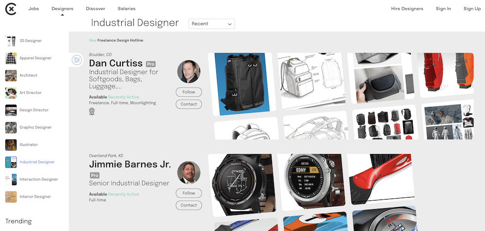
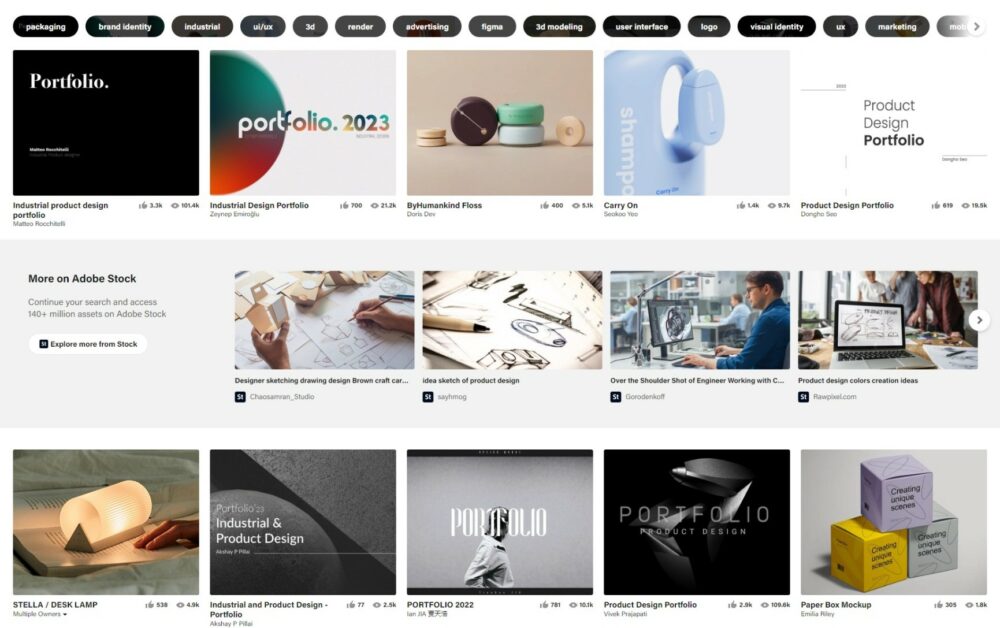
I like these two portfolio websites:
BONUS: About.me
You can create your own website for free at https://about.me/
Mine is at: https://about.me/choutac_chung
It is a bonus you can use to direct people to your personal space.
Note that your page is not searchable on Google in the Free version.
3. What if people copy my idea?
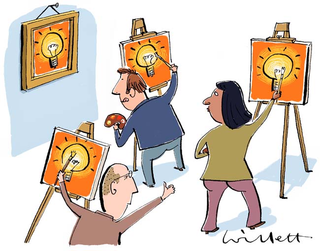
It’s a common concern, but remember: to promote yourself, you must promote your work. You can’t hide your talents.
Embrace the Risk
- Inspiration: If you’re copied, it shows you’re inspiring others and doing good work.
- Improvement: Your style might help others improve in the long run.
- Focus on Growth: Spend energy perfecting your own abilities rather than hiding from copycats.
Keep Moving Forward
- Visibility is Key: If no one sees your work, you’ll miss countless opportunities.
- Ideas in Action: Hiding ideas is equivalent to throwing them away.
- Early Career Strategy: When starting out, focus less on intellectual property concerns.
Your Portfolio as a Marketing Tool
- Use your best projects to get hired by good companies.
- Your portfolio is your most powerful communication tool.
- Treat it like a marketing campaign to secure design interviews.
Exceptions and Precautions
- If building your own company or seriously pursuing a project, consider patenting your drawings.
- For highly confidential content:
- Use password protection online
- Prefer physical presentations for the most sensitive work
Remember, showcasing your work is crucial for career growth.
The benefits of exposure often outweigh the risks of being copied.
Keep creating, keep sharing, and keep moving forward in your design journey.
4. Digital vs Printed Portfolio: Which to Choose?

In the modern design world, both digital and printed portfolios have their place.
Here’s how to leverage each format effectively:
Digital Portfolio
- Send a PDF sample of your portfolio and resume to prospective employers as a teaser.
- Use Adobe PDF Creator’s FULL SCREEN option to minimize distractions.
- Some candidates choose to present on laptops or iPads during interviews.
Printed Portfolio
I personally recommend the traditional printed portfolio for several reasons:
- Unique Interaction: A physical portfolio creates a different, often more engaging interaction.
- Memorable Impact: Unlike quickly swiped digital images, printed work invites the eye to linger, similar to a canvas in a museum.
- Perceived Value: Paper format often lends more value and consideration to your work.
- Easy Navigation: It’s typically easier to flip through physical pages than scroll through digital images on someone else’s device.
- Clear vision: Your portfolio being in a bigger format, the whole team can gather around and have a clear vision on your work even at a few meters away.
- Engaging: It happens the design team discuss, debate around your artworks. While a showcase on iPad, the team may be tempted to remain silence till you finish your presentation.
The Digital Dilemma
Consider this: How many Instagram artists’ work do you remember after 5 minutes of scrolling?
Digital displays can sometimes trigger a sort of “quick amnesia“, resetting your brain like a goldfish!
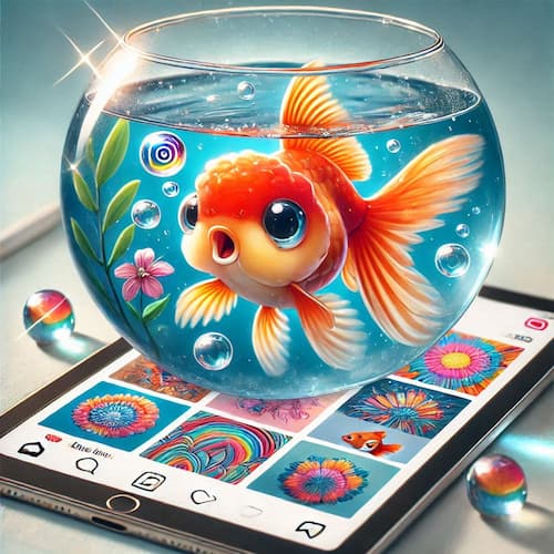
While a digital image may catch the eye momentarily, it’s often quickly forgotten.
In contrast, a printed portfolio invites deeper engagement and leaves a lasting impression.
Recommendation
Experiment with both formats. Use digital for initial contact and convenience, but bring a high-quality printed portfolio to interviews for a more impactful presentation of your work.
A3 Printed Format
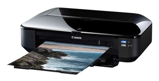
As for the format, I’d suggest printing your portfolio pieces in size A3.
An A3 printer is a good investment for a designer, and you’ll likely use it for degree projects as well.
For your portfolio, consider printing on photo paper – however, avoid glossy surface. It’s a bit tacky for the eye.
I recommend mat and soft paper surface.
PRESENTATION TIP: Try to keep your images either all horizontal or all vertical if possible.
So, you won’t have to rotate your portfolio during your presentation. That might be distracting.
5. What to Include in Your Design Portfolio
A well-crafted portfolio is crucial for landing your dream design job. Here’s how to structure it effectively:
Content Selection
- Showcase Relevant Work: Place projects most related to the job you’re applying for at the beginning.
If you apply for Nike, move all your footwear projects in front of your portfolio. - Organize Thoughtfully: Consider ordering by categories or themes rather than just best to worst.
- Quantity: Include 6-10 strong projects, not everything you’ve ever done.
(Too much information kills the information)
Creating New Projects
If you lack relevant work, create your own projects!
As a student, this is your time to dream big and showcase your potential.
PERSONAL STORY:
When I applied for Charles & Keith, I had plenty of sneaker design projects. But none were about Lady shoes.
So, I spent my whole weekend to create a collection of shoes and printed them on glossy paper to gift the HR for my preliminary interview. I had a second interview later on with the R&D director to whom I introduced my portfolio too. I don’t know if he had seen my booklet version of portfolio at that time.
However, after I was hired, the company organized a meeting to welcome newcomers from all departments.
I gladly saw my booklet on the hand of one of the main managers! Before everyone left the office, she congratulated me personally on how beautiful she likes my shoes. : )
When you crave for a position you love, do the extra mile!
Imagine you want to date a person you like very much; what would you do to attract her attention on you?
That work experience in Singapore and China is one of the greatest things happened in my career as a designer.
Project Presentation
For each project, prepare:
- A short pitch
- The story behind it
- How it improves people’s lives
- Key product features
How long?
Try to divide 20 minutes by the number of projects you want to present.
If you have 5 projects, spend 4 minutes max per project is ideal.
Of course, the day of the interview, be flexible.
PERSONAL STORY:
During one of my first internship interview in France, the team bring me to the coffee break table to introduce myself. We chit chat for 1 hour and I even had a tour of the company!
They ended to tell me I was overqualified for the internship role. That is fine. I had a great moment. I learnt an interview is about talking to humans. Not serious and grumpy people wearing suits.
(It was about removing backgrounds of thousands of people pictures. Boring! I am glad they were fully honest with me).
Recommended Project Layout
- Cover page (optional) with project brief
- Mood board with keywords
- Research compilation (include a few key sketches)
- Final product presentation
Include prototype pictures or material samples if available.
Including Older Work
Don’t be afraid to include older projects if the ideas are still strong and relevant to who you are as a designer.
Stand Out from the Crowd
The key is to differentiate yourself from other candidates. Use these portfolio tips as your “marketing weapons” to get noticed positively and rise to the top of the candidate list.
Remember, your portfolio should reflect your unique perspective and skills.
Stick to what you believe in and showcase your best work confidently.
The secret is always to do things differently from the masses.
These tricks are designed to put you on top of the list of prospective candidates and to get you noticed in a positive way.
Here’s a set of “4 marketing weapons” to make you stand up and stand out.
Weapon #1: Stop boring “Accountant Resume”! Make it Attractive!
Your resume is your first and main point of contact since you’ll send it to the company by email.
Done right, it will tease their curiosity and get them interested in your online portfolio.
TIP: Print a few copies of your resume for the day of the interview.
You may have a few people from different departments there to meet you. We never know!
Do not expect anyone to remember the details of your resume you have sent online.
With different countries there come different rules, and resumes come in all shapes and sizes.
Some resumes include pictures; some don’t mention gender, and so on.
We tend to write resumes like we’re filling out boring tax forms.
But we’re not machines; we’re designers!
When I went to look for a job in Singapore, I saw a pile of resume at HR department.
Designer candidates applied with black and white regular resumes like if they applied for a job at a bank.
Good for me!
I was the only one with a graphic and colorful resume!
Guess who the HR remembered? :)
In my opinion, when you’re applying for a creative job, the “normal rules” “fly out the window.
Question the status quo and think HOW CAN YOU MARKET YOURSELF CREATIVELY?
Do something exciting for the eyes.
Make it graphic or choose a minimalist presentation showcasing your work.
Dare to show your personality!
TIP: Import some fonts from https://www.Dafont.com to personalise your resume.
But be aware of choosing tasteful one. Avoid Disneyland or Yahoo typo. : )
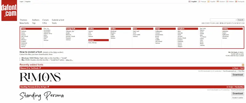
Ha! Give it a try.
Weapon #2: A Creative Business Card
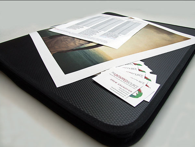
Even as a job seeker, a business card can be a powerful tool to introduce yourself and make a lasting impression.
Why Business Cards Matter:
- Professional Introduction: It’s a tangible representation of your personal brand.
- Specialization Showcase: Highlight your design niche (e.g., product design, transport architecture).
- Mutual Respect: The exchange of cards creates an immediate sense of professional courtesy.
Design Tips:
- Break the Mold: Don’t limit yourself to traditional rectangular white cards.
- Play with Elements: Experiment with colors, formats, and materials.
- Balance Creativity and Simplicity: Aim for “creative but simple” to make a memorable impact.
Personal Experience:
For my master’s degree, I created multiple sets of business cards with varying backgrounds.
Sometimes, I let people choose their preferred design, adding an interactive element to the exchange.
Make it playful!
People will remember you.
Key Takeaway:
There are no rigid rules here. Whether you opt for a bold, unconventional design or a more subtle approach, ensure your card reflects your unique personality and design style.
Remember, your business card is often the first tangible piece of your work that a potential employer or client will see. Make it count!
Weapon #3: Send a Mini-Portfolio
A mini-formatted portfolio can be a powerful tool to showcase your work and leave a lasting impression.
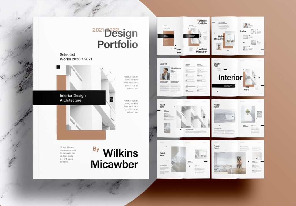
Here’s why it’s worth considering:
Production Tips:
- Print your work on high-quality glossy photo paper (Yes glossy surface is ok for the mini-portfolio format. You try to make it appetizing like a Candy!)
- While it may be costly, view it as an investment in your career
Strategic Distribution:
- Give these mini portfolios out strategically to companies you’re interested in at the end of the interview along with your name card.
- Any physical, attractive item with perceived value can increase your exposure
Benefits:
- Extended Visibility: May remain on someone’s desk for days (while a digital file remains hidden in their computers)
- Increased Exposure: Could be noticed by others in the office!
- Portability: Easy for recruiters to show colleagues or bosses on the go, at the coffee break
- Personal Touch: Recruiters might even bring it home and share it with friends and family
Influence Factor:
The opinions of those around recruiters can have a significant impact on their decisions.
Your mini portfolio could be the catalyst for these conversations.
My design teacher told me:
You know you hit their attention when the recruiter talks about you to his wife (or husband).
When to Gift:
- If you’ve had a positive interview experience, consider gifting one to your interviewer
- It shows appreciation and leaves a memorable impression
- If the interview didn’t go well, there’s no obligation to mention or offer it
- Remember, without this physical representation, your work might not reach as many eyes. It’s a simple yet effective way to extend your reach and make a lasting impact in your job search.
Weapon #4: Extra Artworks
Showcasing your diverse artistic talents can set you apart from other candidates.
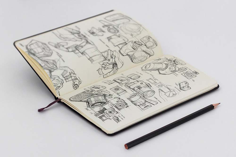
Here’s how to leverage your additional creative pursuits:
Create a Separate Booklet
- Compile a collection of your other artistic works.
- This could include photography, manga, illustration, concept art, sculpture, or any art form outside your major.
- It does not have to be a sketchbook. You can compile multiple artworks and attach them with a clip.
When to Use It
- Keep this booklet separate from your main portfolio
- Only present it if you sense the recruiter is receptive
- It’s a hidden ace up your sleeve – use it wisely
Potential Benefits
- Shared Passions: You might discover common interests with the interviewer
- Versatility: Demonstrates your range of creative skills
- Conversation Starter: Can lead to more personal, engaging discussions
Words of Caution
- Don’t force this additional work into the conversation
- Let it remain in your bag unless the opportunity naturally arises
Final Thoughts
Preparing a comprehensive portfolio takes time and effort, but it’s a worthwhile investment in your career. Remember to:
- Build your portfolio gradually over time
- Avoid the stress of last-minute compilation
- Keep updating and refining your work
By showcasing your main portfolio and having this extra artwork booklet on hand, you’ll be well-prepared to impress potential employers with the full range of your creative abilities.
Conclusion
Creating a powerful portfolio is an essential step in launching your design career.
By treating your portfolio as a marketing weapon, you can significantly increase your chances of landing your dream job and standing out in a competitive industry.Remember these key points:
- Your portfolio is more than just a collection of work—it’s a reflection of your personality, creativity, and problem-solving skills.
- Invest time in crafting a visually appealing and well-organized portfolio that tells a compelling story about your design process.
- Consider both digital and physical formats, each offering unique advantages in different situations.
- Utilize the “4 marketing weapons”: an attractive resume, a creative business card, a mini-portfolio, and a showcase of extra artworks to make a lasting impression.
- Don’t be afraid to show your personality and think outside the box—after all, you’re applying for a creative position!
- Continuously update and refine your portfolio as you grow and improve as a designer.
By implementing these strategies, you’ll transform your portfolio into a powerful tool that not only showcases your skills but also markets you as a valuable asset to potential employers.
Remember, your portfolio is your best advocate in the design world—nurture it, perfect it, and let it speak volumes about your talent and potential
If you also have special techniques to get hired, please share it with us!
I’ll be posting another article soon giving some tips about design interviews.
Stay posted!
Cheers,
Chou-Tac
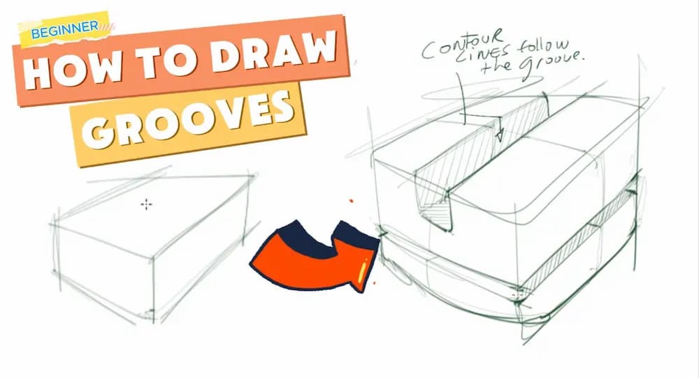


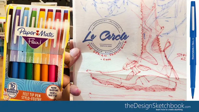



[…] Before starting, I published an article for artists and designers if you want to make your portfolio a Marketing Weapon. […]
You have to be crazy to put your portfolio online these days. Thievery is common now to the point of it being a destructive force to the industry. People in other countries are not subject to the same laws.