Hey guys!
How are you today?
I just went back to my Calystehnic class. (Also called Street workout). It’s now resting time, and I take a “few” minute to write to you.
TIP: Sketch in the rush!!
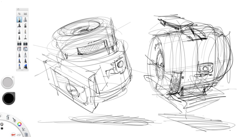
The sketch below is what I drew just before going out 3 hours ago. I was in the rush. I didn’t want to be late for my class, but I also wanted to draw that camera so bad with my speed technique. So I sit, calm down and draw. Life’s tiny pleasure can’t wait, right?
I didn’t expect I would draw that fast.
I completed both within 5 minutes! I drew the first on the left, then I saw I still have a couple of minutes more – so I did the second one is even more rush. That’s why it’s a bit more awkward than the first. Hehe. Whatever! Haha.
TIP: When you draw wrongly and feel frustrated: Smile and tell yourself: “Whatever I will do better”. That’s logic, because the human is by nature in a perpetual learning process.
TIP: Urban sketching style inspired!
It’s a method I sometimes use when I draw urban sketching. I go straight to the essential with a minimum of construction lines.
It’s not always easy to know when a sketch is good enough – that we should stop adding details. Before you start drawing, try to define roughly what is your expectation.
For this first draft:
- I didn’t aim to do a good sketch but gather quality information.
- That sketch is FULL of imperfection, so many things go wrong with it. But, it doesn’t matter.
- When you do this kind of preliminary research at work, you don’t care about perfection. It doesn’t worth the time neither the effort anyway.
- It’s not about being lazy, but good management of your resources. It’s ugly, so what. Nobody will see them. But only YOU! As long as your sketches have meaning to you. You win.
If my expectation was drawing something perfect in one shot I would have failed anyway. And with a maximum frustration as a rotten cherry on the top of the cake – because I would have wasted 3 hours on it (and missed my calisthenic class :P).
TIP: Draw with iteration
There is no magic in sketching, we need to train, and redraw the same thing, again and again, multiple times to succeed. That’s why when you see senior designer’ sketches, you say Wahh! And you are maybe drooling of admiration but maybe also feel miserable. 🙁 It’s because you have never seen all the series of bad sketches they did before!
So keep up! You will also do your share of bad sketches! Like them, you won’t publish them on the Internet. Hehe.
This conversation comes from a podcast I had with Nick Huber from Mesh01.com, about the importance of sketching for a designer. I highly recommend you listen to his advice about the real world.
TIP: Sketch like a puzzle
Let’s use the puzzle as a metaphor.
I purposely draw this Sony camera super bad & fast so my brain could register the main information.
- STEP 1: The pieces I have in my mind are now like a puzzle. It’s still blurred, but that’s ok. I can visualize a lens, a button, a flash, a plug… and have a rough perception of their position. I start to visualize them in 3D.
- Step 2: Carry on sketching more ugly doodles – taking all the puzzle pieces (the camera elements) assembling them well with more precision.
I will use fundamental techniques such as perspective, proportion, transparency vision, axis to align the puzzle pieces nicely.
When you draw a product,:
- Do not draw only one of them, but many!
- Every time you do an extra Ugly doodle, the product gets clearer in your mind.
- Your sketches will get sharper and sharper. This is called drawing by iteration.
TIP: You will rise you rate of success – and low your rate of stress. For that, you have to accept you are no magician, there is no innate talent involved, but work and passion.
TIP How to create and draw from imagination
Do not only draw the edges of the product you look at. Identify the different parts:
- Zoom,
- Lighting,
- Recording,
- Stabilizing
- Batteries
- …
so you give sense to the product.
You don’t sketch for just reproducing things like artist drawing portraits using a grid.
As a designer, you want to create by yourself, not only copy.
So, remember to identify the functions.
A mind hack is to do not only think:
- button,
- flash,
- lens,
- memory card slot
- …
But instead, think of action:
- capture photo,
- light the scene,
- zoom closer,
- record photo and video
- stabilize the image
- record the memory
- …
Why? Because it will help you get a lot more creative when you draw!
You activate your designer creativity training your mind to look for ideas and solutions for users.
For example, ask yourself: What if the camera is:
- for kids: bold forms, colorful, soft material, indestructible, safe…
- for rock climbers: tough, 360º view, emergency call and rescue set
- a flying spy camera: light, silences, change color according to the sky color
- for firefighters: heat and water-resistant with a human visual detector in the dark and human voice detector)
- …
Design possibilities are infinite when you think of users first when you create!
All of these products are different.
However, they all have the photo/video capture in common.
TIP: Take a shortcut drawing with underlay
You can also take a shortcut using the ugly doodle as an underlay. It’s a super common practice among designers. It’s NOT cheating. Oh ok, it’s cheating, but it’s allowed and there is no shame for it! 🙂
Believe me, in case you reject this idea, you might handicap yourself for very long. (I did that mistake when I was a student, till I saw other students more beginner than I was making greater stuff)
You are free to use transparent paper, or scan it and import it in your favorite sketching software such as Photoshop or Sketchbook Pro or Mischief for example.
By default, I recommend using paper with 80g. If you want to gain more transparency, you can buy 70g.
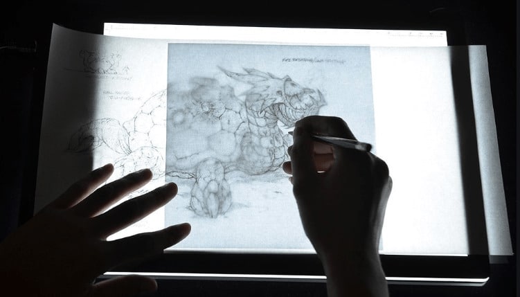
Another alternative is to get a led light pad for drawing and tracing.
Update: Mischief is unfortunately no longer active.
I did that sketch on my Wacom, a trick would be adding a paper on top of the screen, and using the retro lighting of the screen to redraw on top – like a luminous table! 😀 (It’s a bit blur, but I can scale the sketch as many times as I wish!
Remember there is no magic.
Ugly doodles have to be combined with the fundamentals of drawing!! Start learning with perspective and simple volumes in 3D. 🙂 Otherwise, even after 3546 ugly doodles, it will be the same as the first one. Ok? So don’t get grumpy.
Better your master your fundamentals, better your Ugly doodles will look good at the start. Be patient, and be driven by your passion.
The ugly doodles will help you gain confidence and stop you from your perfectionism tendency. Feel free to make a try at Ugly doodles anytime. It’s still a lot of fun anyway!
Have fun!
Cheers,
Chou-Tac



[…] Remember, repeating the same actions expecting different results isn’t the way forward. Instead, learn from your mistakes and grow. […]
[…] With that motivation gained and confidence, you will every day get closer to your goal, you won’t give up (like most beginners do within the first bad doodle!). […]
Lucas!I mean look at how heartbroken they were when they had to separate :/ He proved us he can overcome his fear, whereas Derek is even more of an ass licking idiot!
Thanks for these tips, drawing is my passion,regardless of the field !
Yeah, creativity is so wide ! 😀
Thanks Chou-Tac for bringing up that raw skill which seems forgotten nowadays 🙂
Hey Rooben,
My pleasure.
I believe traditional methods such as sketching is one of the most fun and creative part of being a designer though. Hopefully more people join the game. 🙂
Hi I am so in love with this new collection ! She is just the cutest ever. The blush papers are so beautiful with her and the lace is to die for. My stamps came yesterday and can't wait to play with them after work ! Have a great crafty day. Kitty:D